

New corporate logos at end of 2010
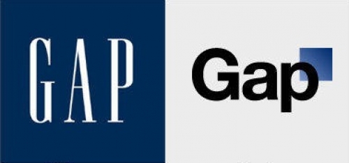
The new Gap logo was a huge disaster. Click here to read the whole story on Adage. While the Gap logo may have been misguided, there are plenty of re-branding initiatives that have been very successful in 2010.
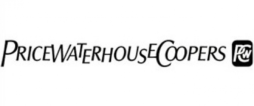
The financial giant PriceWaterhouseCoopers, has dropped the full name in favor of initials. Everyone has been calling them pwc for years, anyway. The new "pwc" typemark and colorful digital flower thingy, designed by Wolf Olins, is a departure in the financial sector, and will hopefully begin to establish a new vernacular. An animated version of the logo can be seen on the pwc site.
Read some backstory about the new brand strategy here.
Bausch and Lomb worked with Pentagram to help them rebrand their business to focus on total eye health care. Their previous brand focused on contact lenses exemplified by refraction. The corporate colors have been freshened up and transparency has been introduced to exemplify the new direction for the brand. B+L's re-nu brand has been redesigned too. See more examples of the re-branding and read the strategy on Pentagram's site.


 Subscribe
Add Comment