LACMA's food court
The concept of the food court has transformed in the last few years from a basic mall cafeteria to a fully branded culinary lounge experience, with food sophistication on par with the attention to detail of the interiors. The latest LA examples at the Westside Century City and the Westfield Pavilion in Culver City are great examples. The new Santa Monica Place has go so far as to rename the concept all together. They call it the Dining Deck. But in the end - it's still just a food court, plastic trays and all.
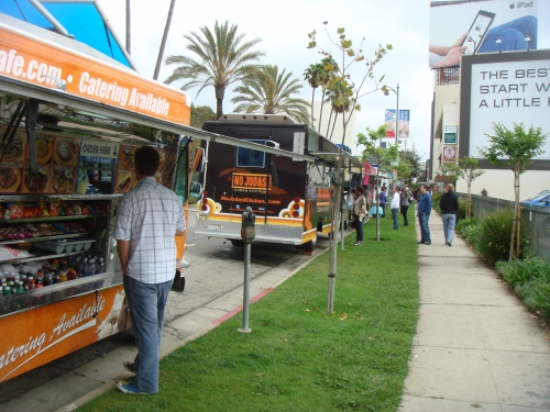
After a visit to the newly opened Resnick pavilion, I left the property in search of sustinance. Turning east on Wilshire revealed a caravan of food trucks. Now this is a new concept in food courts. It's moving, changes from week to week and elevates the experience of visiting LACMA. So what you need to give up some amenities, like chairs. Or tables. The food is amazing and the experience of watching the chefs work their magic in those micro-kitchens is lots of fun. Click here to visit LACMA's site.
Age of Mammals press on ArtDaily.org
Read the full article here
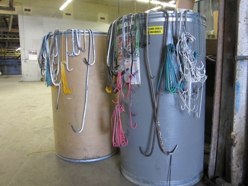
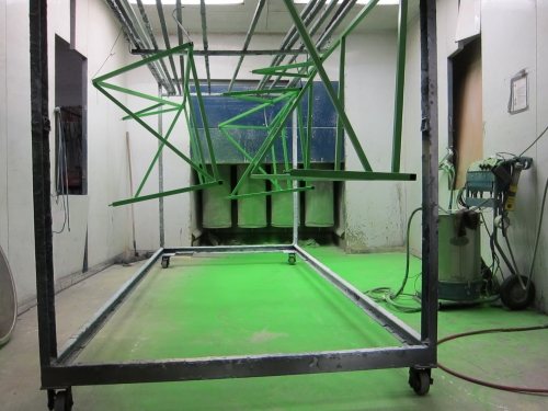
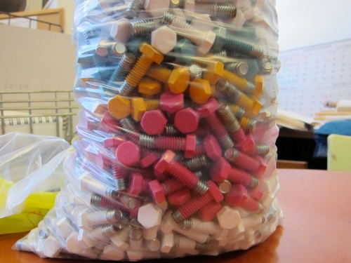
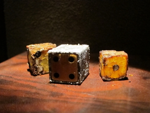
Beautiful refuse. Candy coated steel.
This beautiful refuse is a typical by product of powder coating steel. The bolts are used to fill the holes that would otherwise fill with the powder coat. Hangers and overspray are covered over by the next batch of color.

Fairly Young Museum Treasures
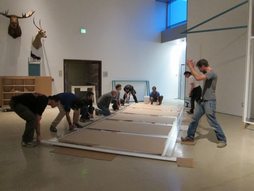
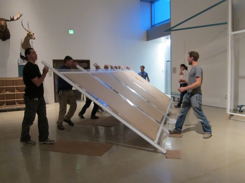
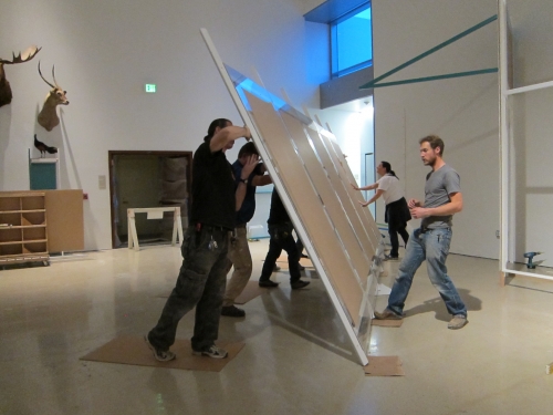
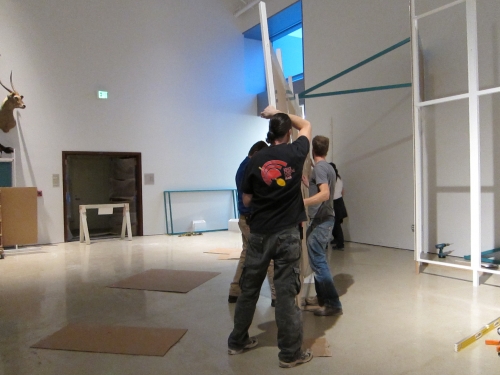
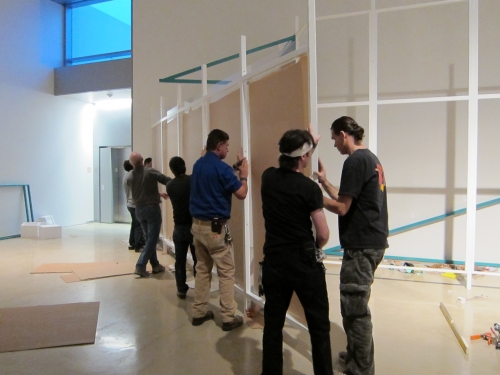
Among the NHMLAC's amazing resources is its staff of master craftsmen, builders, experts and technical wizards. It is a pleasure working along side them every day.

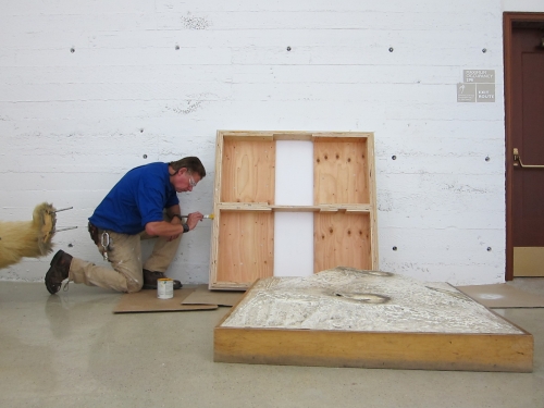
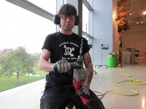
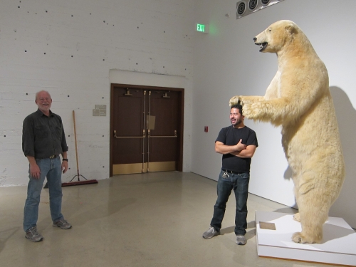
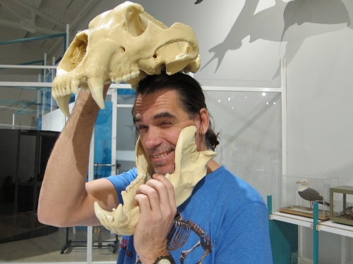
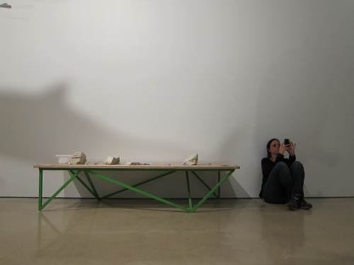
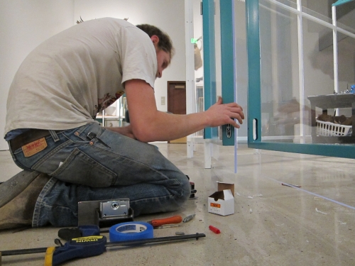
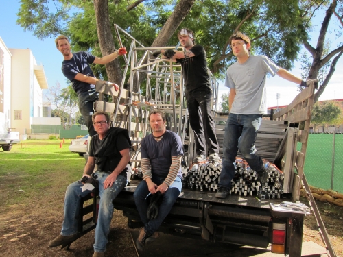
NHM DC team: left to right, top to bottom. Josh, Phil, Liam, Scott, Jerome. Not pictured: Kristina, Michael, Robert, Tim, Chris, Justin and Michelle.
The Once-living
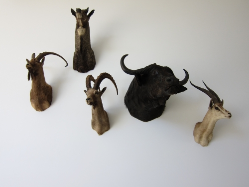
The NHM's massive collection of taxidermy is featured in the new Discovery Center. The NHM's in-house taxidermist is responsible for creating, caring for, and displaying every once-living creature on display.
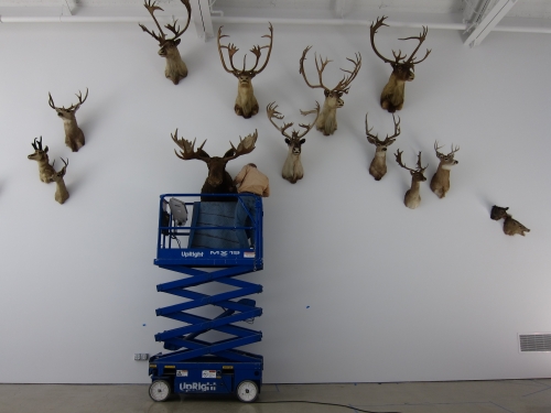
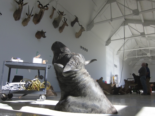
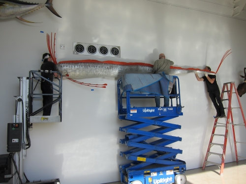
Sample Not Cleared
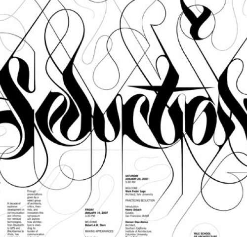
In April 2008, hand lettering master, Marian Bantjes, teamed up with Pentagram partner Michael Bierut to develop another home run project. In the great tradition of hip hop, Sean Combs "sampled" the beautiful rococo lettering and reshaped some of the letterforms to spell Sean John. Fast Company has taken exception. Compare the artwork here.
To marvel at the creations of Marian Bantjes click here.
A Rainy LA Day
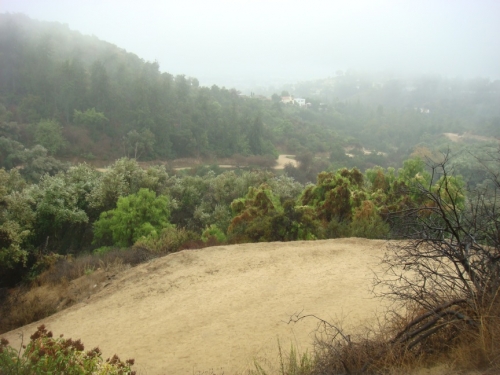
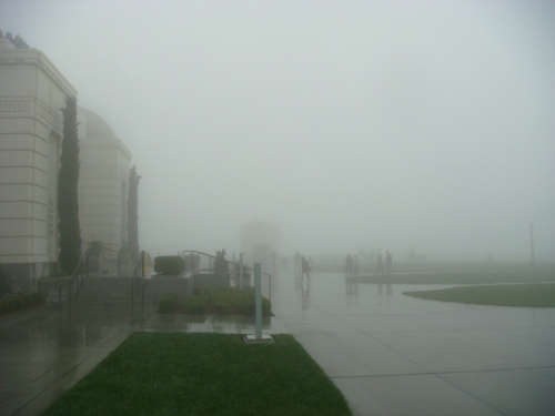
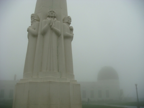
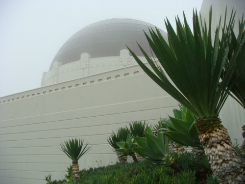
A rainy weekend in LA sends residents running for cover. I'm usually no exception, but while I cleaned my office on Sunday morning, I couldn't help but wonder, what would one of the busiest landmarks in LA look like on a rare, rainy Sunday morning. 10 minutes later I was out the door and headed for Griffith park. The parking lot was empty, the hiking trail was empty, Griffith Observatory was empty. Not only did I get in a nice little workout, but experienced a part of LA in a way that few rarely do.


Science Magazine reviews Age of Mammals
"Who doesn't remember the first time they entered a natural history museum and dropped their jaw at a large, articulated skeleton of some megamammal—most likely a mastodon, mammoth, or African elephant—that greeted them in the rotunda? I have fond memories of museum visits from my youth that transported me to locations around the world, revealing the fauna and flora characteristic of often exotic sites. Museums of science and natural history have come a long way since the days of static dioramas, and the new Age of Mammals hall at the Natural History Museum of Los Angeles County does not disappoint. It inspires the wonder I felt when I was younger while incorporating an accurate depiction of mammalian evolution that visitors of all ages can grasp."...
Read the full article here.
Cigarette Branding Loophole Closed Forever
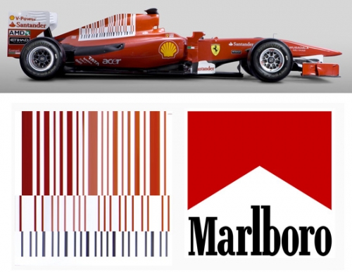
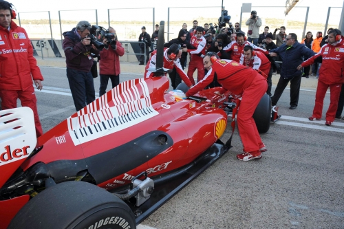
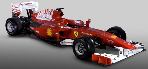
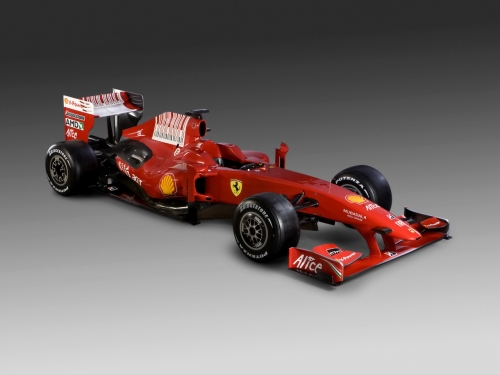
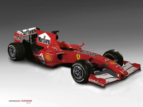
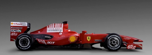
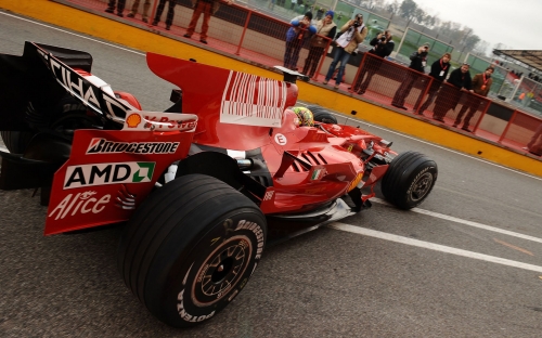
F1 engineers have been exploiting loopholes in regulations to make their cars faster since the sport began. So, it's no surprise that Ferrari has applied that same strategic thinking to promotions. Marlboro has been Ferrari's title sponsor since 1997. The official team name is Scuderia Ferrari Marlboro. In 2002 the FIA, F1's governing body, banned cigarette advertising on F1 cars. Ever since, the Scuderia has been referencing, eluding to, and hinting at a Marlboro logo, without showing the logo. In May of this year the FIA finally said enough is enough and forced all references to Marlboro be removed permanently. While these outlines, stripes and barcodes are not a registered trademark of Marlboro, they certainly mean Marlboro.
To celebrate SFM's success at tricking the FIA for nearly eight years, I have collected as many iterations of these logos I could find online. Please send me more if I have missed any. A contemporary artist in LA has been wheat pasting a parody of the Marlboro logo all over town. Thought it made sense to include it here too. To see more work by this artist click here. To read the full story of SFM's battle with the FIA click here.


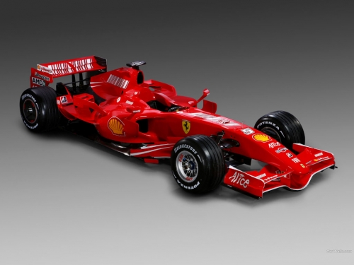

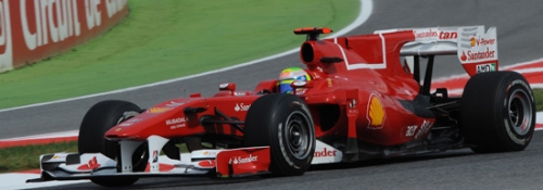
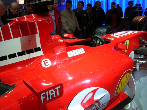

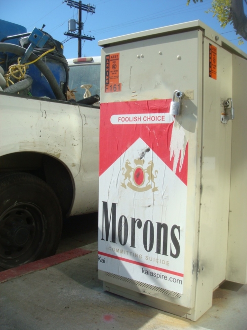
New corporate logos at end of 2010
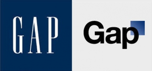
The new Gap logo was a huge disaster. Click here to read the whole story on Adage. While the Gap logo may have been misguided, there are plenty of re-branding initiatives that have been very successful in 2010.
The financial giant PriceWaterhouseCoopers, has dropped the full name in favor of initials. Everyone has been calling them pwc for years, anyway. The new "pwc" typemark and colorful digital flower thingy, designed by Wolf Olins, is a departure in the financial sector, and will hopefully begin to establish a new vernacular. An animated version of the logo can be seen on the pwc site.
Read some backstory about the new brand strategy here.
Bausch and Lomb worked with Pentagram to help them rebrand their business to focus on total eye health care. Their previous brand focused on contact lenses exemplified by refraction. The corporate colors have been freshened up and transparency has been introduced to exemplify the new direction for the brand. B+L's re-nu brand has been redesigned too. See more examples of the re-branding and read the strategy on Pentagram's site.





 Subscribe